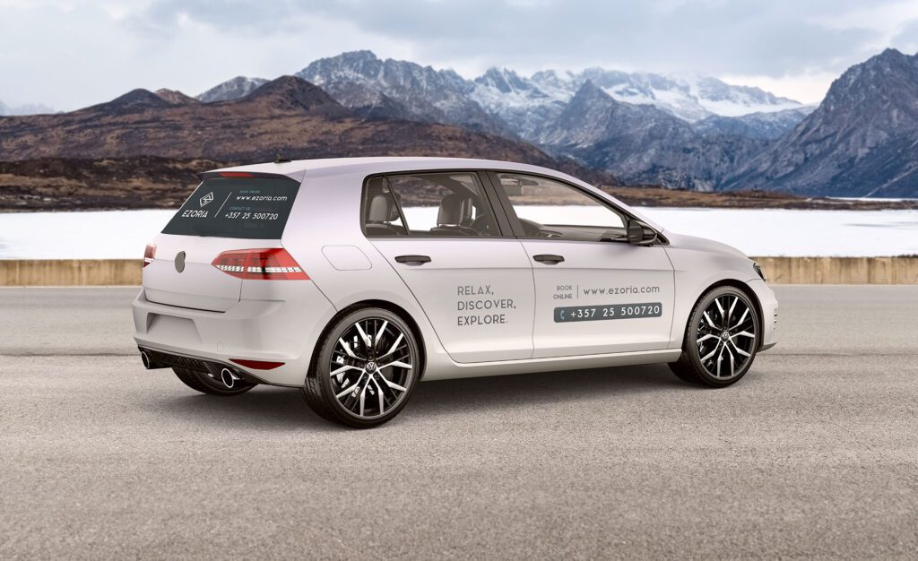
EZORIA REBRAND PROJECT
Ezoria is a Vacation Rental company with a mission to unlock the potential of every property they undertake and bring real and hospitable experiences that guests desire.
Ezoria came to me with a need to rebrand their business. They had already done their market research and had a rough idea of what the new brand identity wanted to communicate.
Below you will find the roadmap of this process.
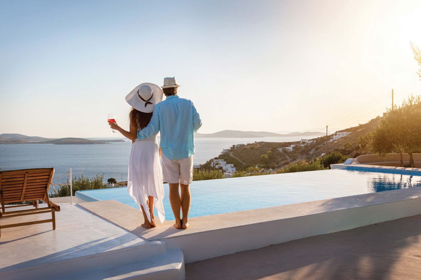
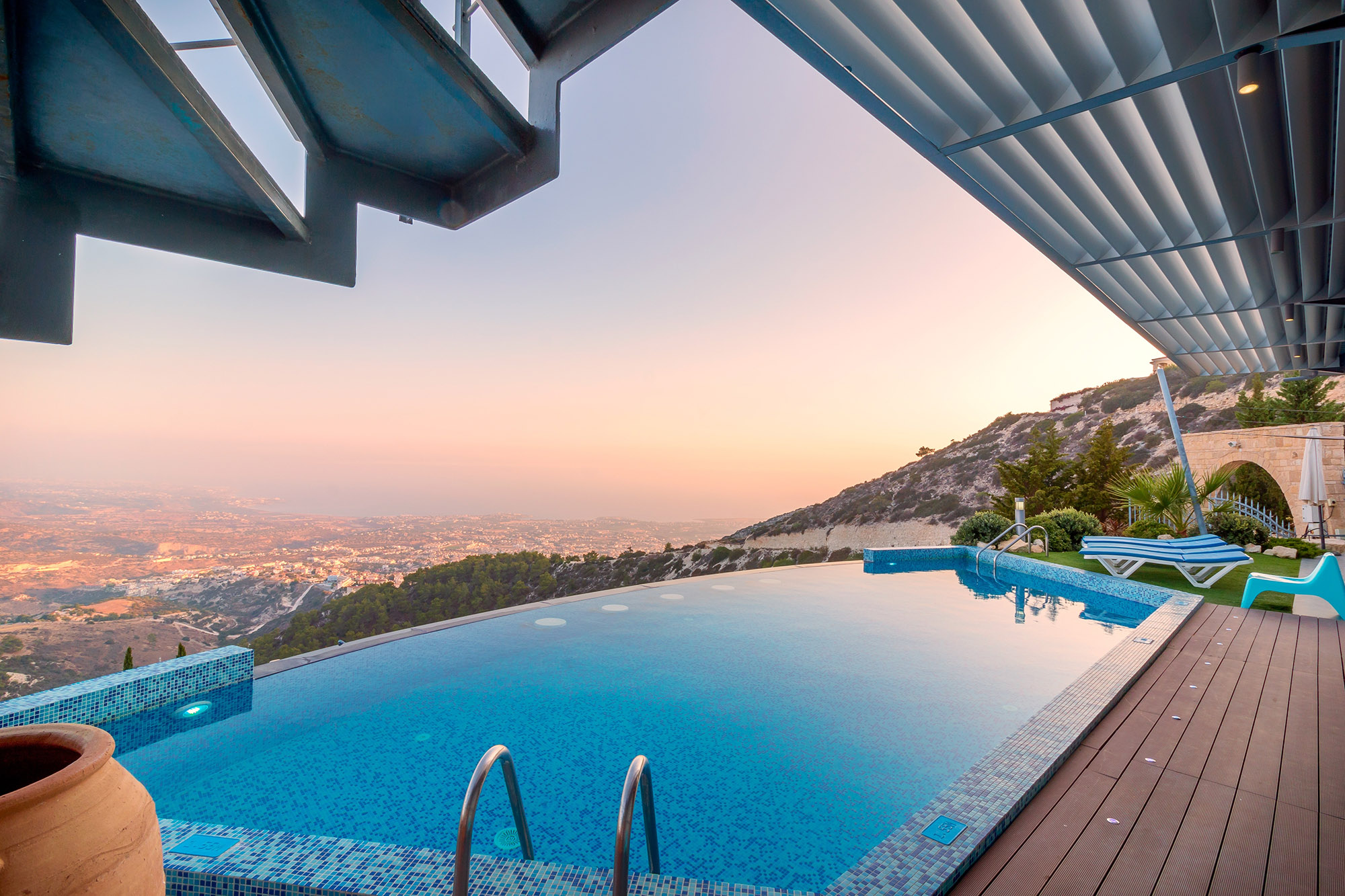
THE BRIEF
Ezoria’s goal is to re-establish its presence as the trusted and go-to travel partner locally.
Ezoria offers services beyond accommodation and that’s what makes them stand out from competitors. Ezoria provide’s value, authentic local experiences, and activities for their customers.
GOAL: To create a logo mark that communicates adventure, exploration, discovery, and a connection with nature.
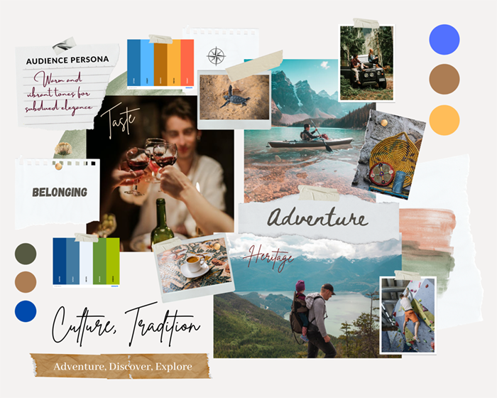
MOODBOARDS
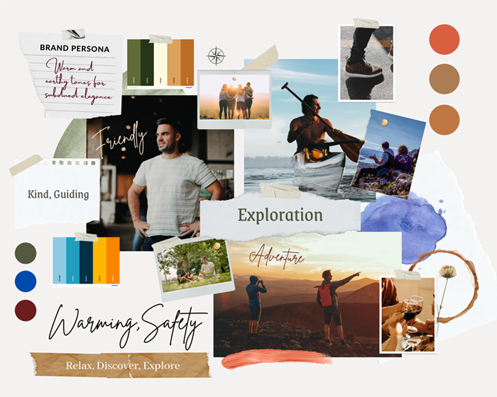
Effective branding starts with the right process. Each step of the process is built upon each other. Therefore the first step was crafting mood boards to assist them with visualizing the style of the brand identity.
Moodboard is a tangible or digital arrangement of visuals that are intended to evoke, inspire or project a style or a concept. It can include imagery, colors, fonts, image references, textures, and design styles.
Moodboard’s role is to help you visualize and comprehend in your mind a concept.
PERSONAS
Personas are created to guide us throughout the branding process. Personas help us get a better understanding of who you are as a brand and who you are serving.
AUDIENCE PERSONA:
Everyday man & Explorer
BRAND PERSONA:
Explorer & Sage
SKETCHING IDEAS & LOGO DRAFTS
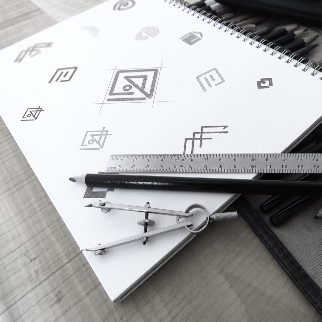
The next step after the creation of mood boards and personas is the rough sketching of logo mark ideas.
In this stage, the top concepts are being selected and presented in Black & White. This helps the viewer to fully comprehend the concept first, without creating confusion. The focus should be on how the concept communicates & functions. The color selection is applied at a later stage.

LOGO DESIGN & COLOR SELECTION
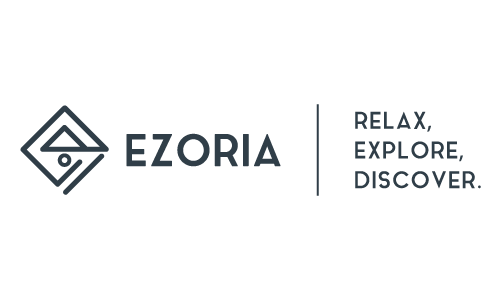
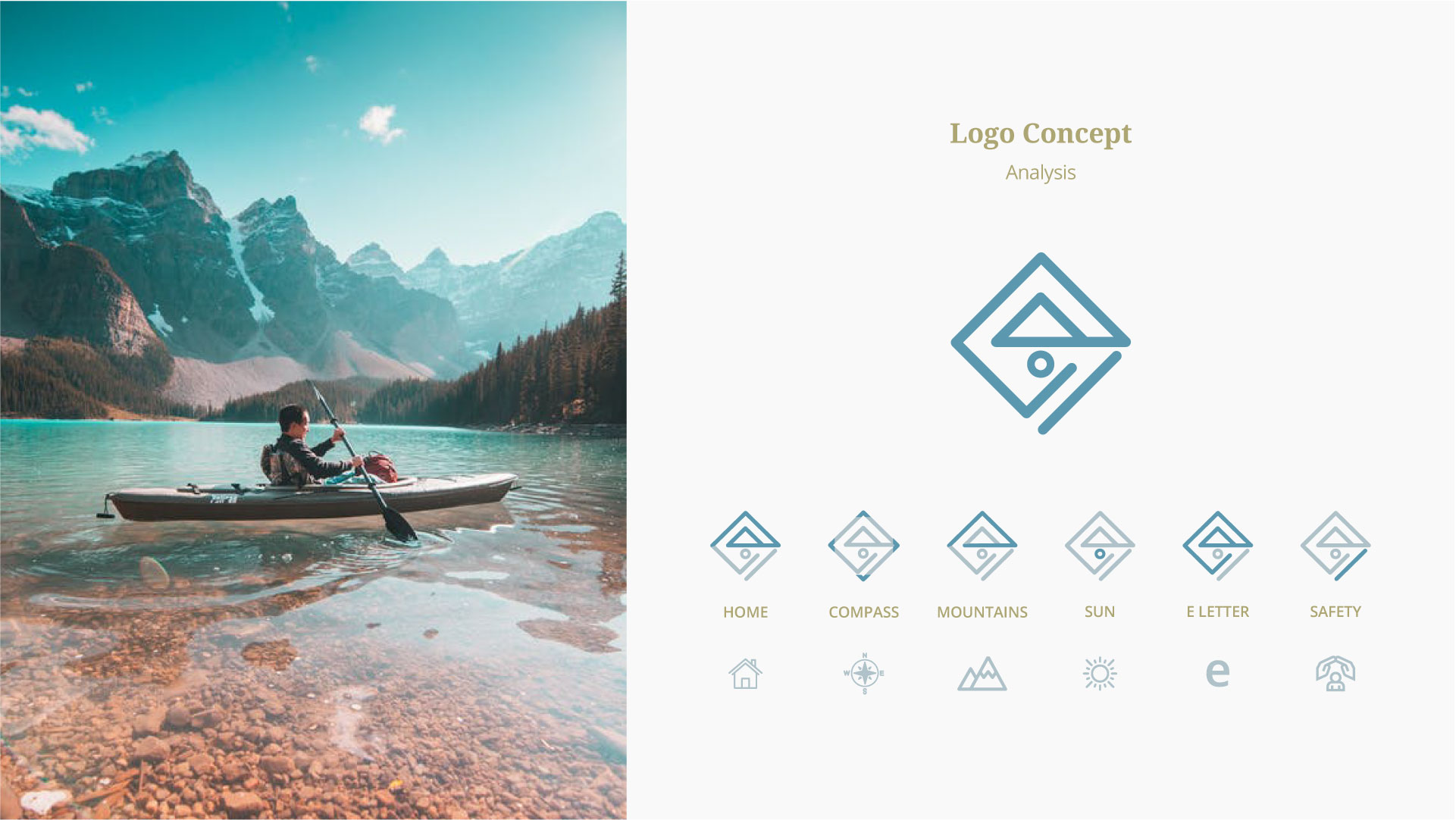
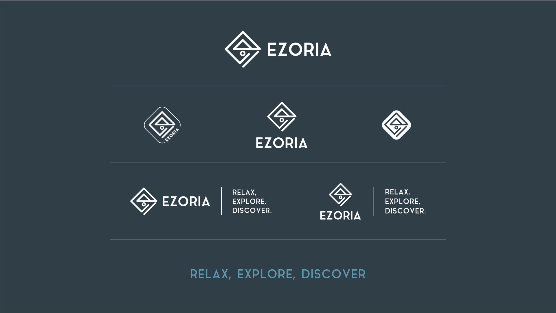
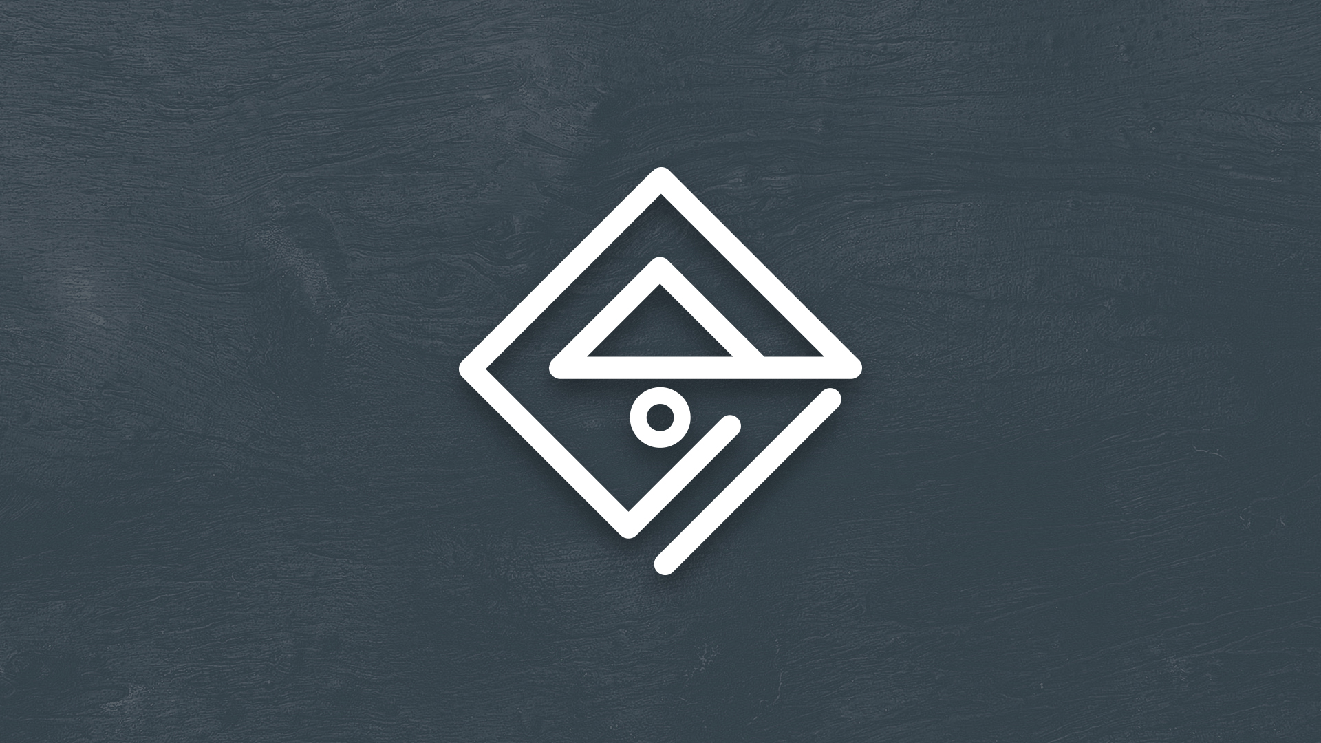
The logo mark consists of geometric lines that form a Rhombus and an abstract formation of the letter E.
The connected lines symbolize various shapes such as the home, compass, mountains, sun. Each corner points the direction as in the compass. Those elements were specifically chosen to communicate adventure, belonging, safety.
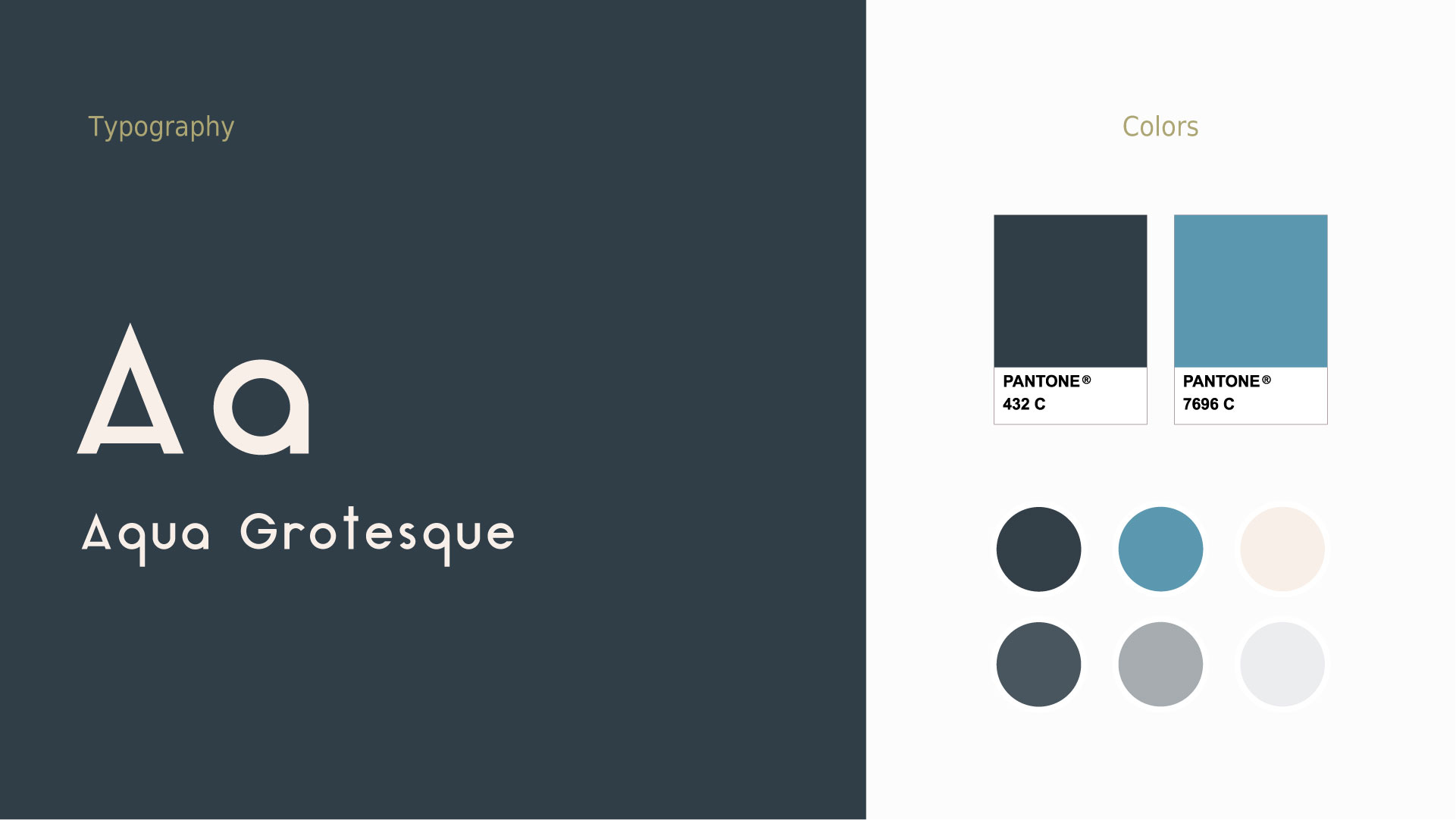
The brand colors were selected using color psychology and strategically to differentiate from competitors.
Primary Color: Dark Blue (Stability, Reliable, ELEGANCE, Sophistication)
Secondary Color: Teal (Self-expression, trust)
PROJECT FINALIZATION
The complete logo family was designed to assist the brand to be versatile and flexible in its presence in various platforms. Logo family includes the Primary logo, Secondary logo, Submark, Icon, Favicon.
In conclusion, the logomark is simple & minimal in form but has a powerful & impactful presence. The goal for the brand identity is achieved as it illustrates & communicates adventure, exploration, discovery.
Final Assets
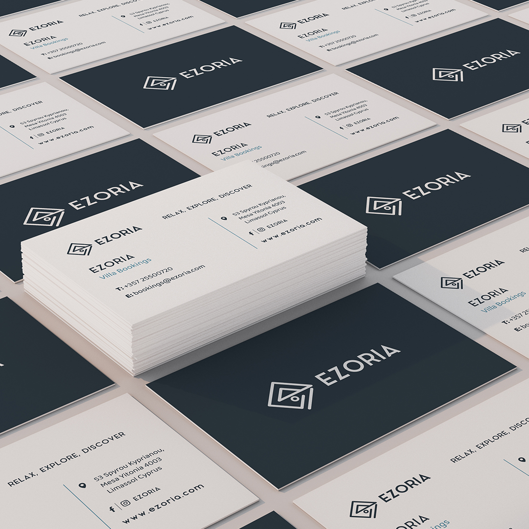
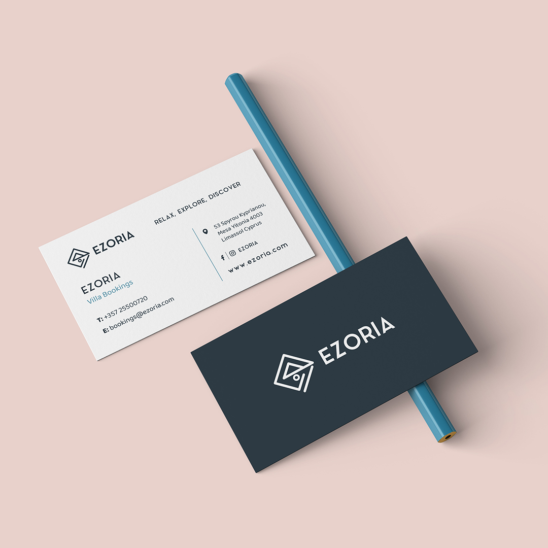
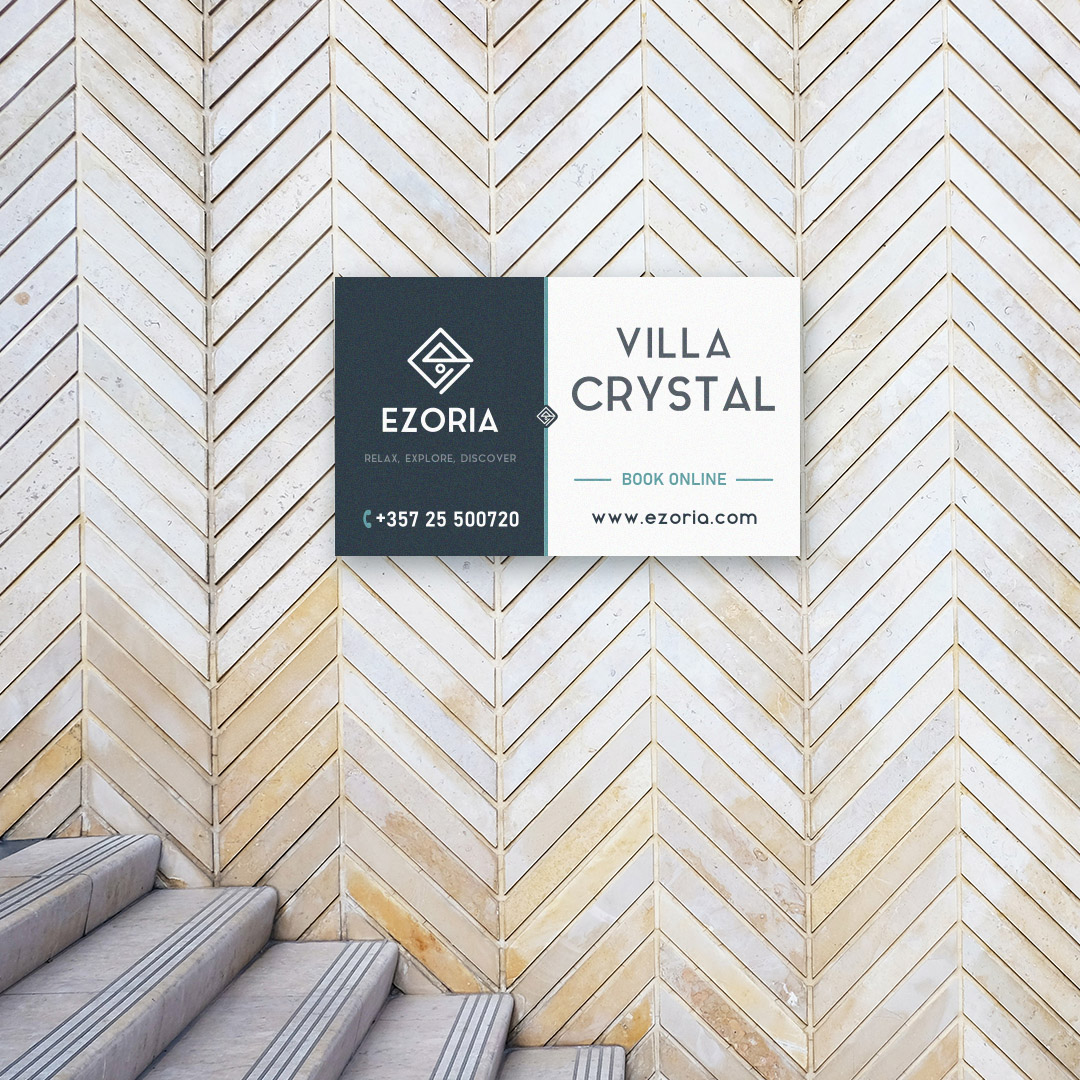
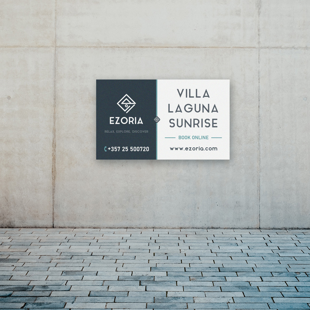
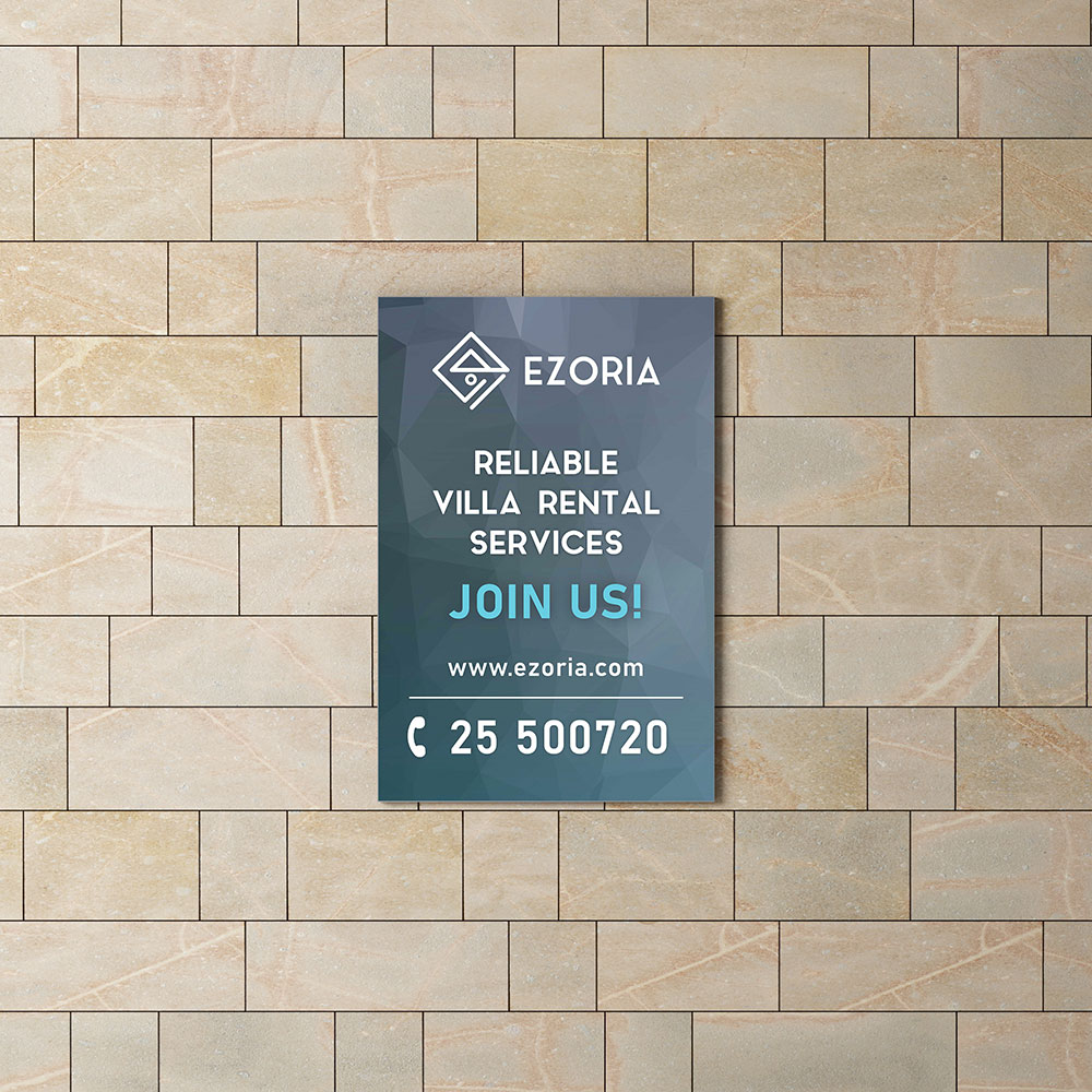
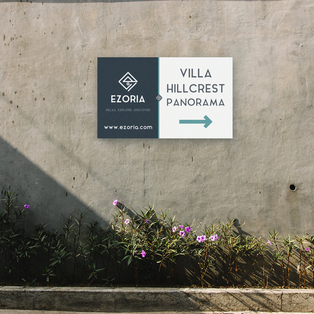
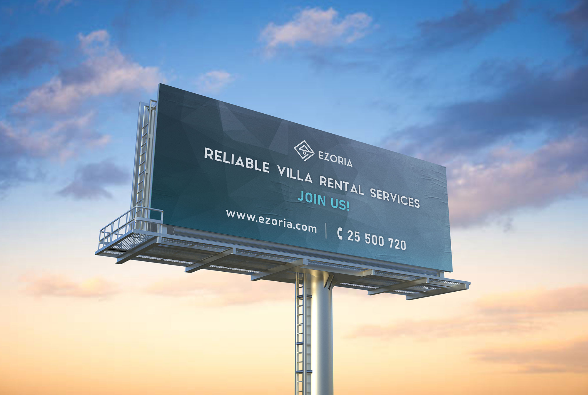
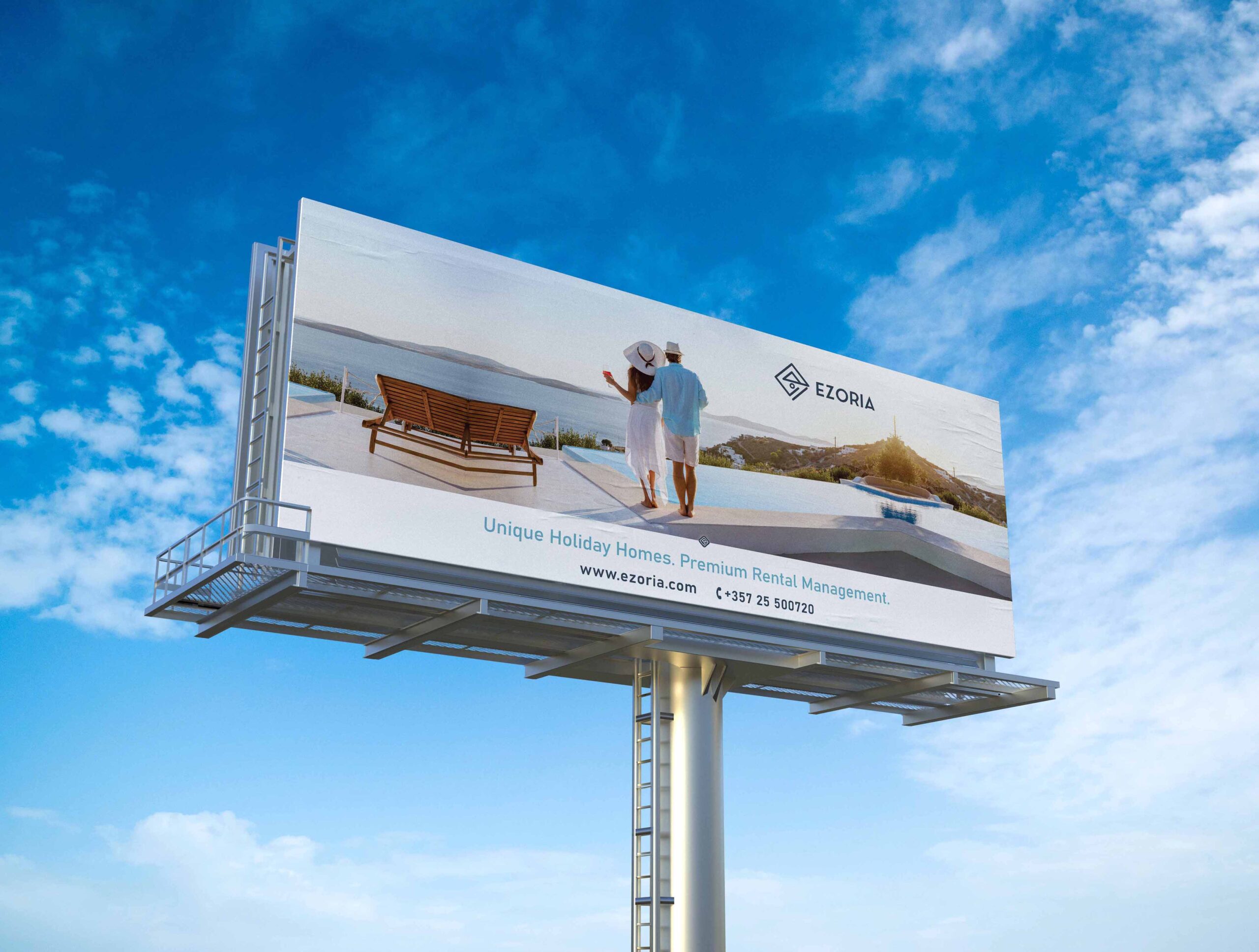
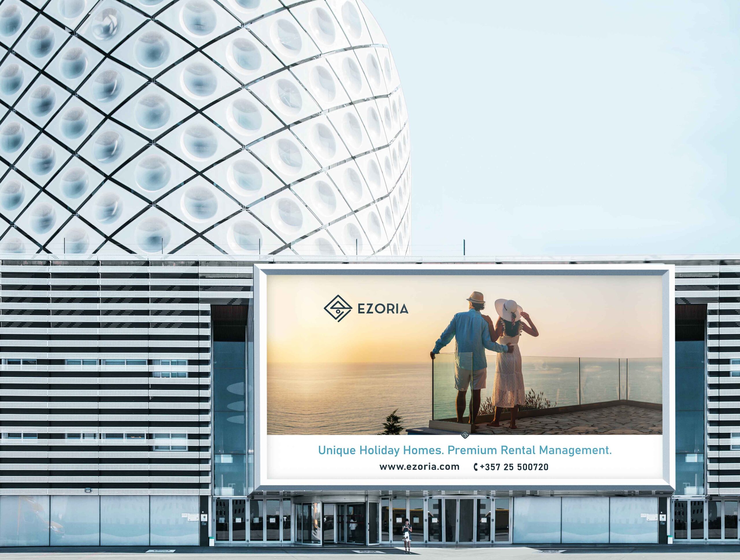
After the logo family creation, the next step to complete the brand identity was to design the assets which includes Business Cards, Stationery, billboard & property signs.

”Valeria was a great professional to work with while rebranding the corporate identity of Ezoria. Our collaboration was very smooth, and her deliveries were always very well executed, on time and flawless. She is definitely one of the most dedicated, detailed -oriented and creative graphic/brand designers I’ve worked.
Eirini PasantaMarketing Executive / EZORIA
FINAL PROJECT
BUSINESS CARDS & STATIONERY
SLOGAN

SIGNAGE
”She is always willing to go the extra mile to help when needed and to provide solid creative direction in order to achieve high quality end results. We love our new Ezoria logo and we are very pleased with the overall rebranding experience with her. I’d fully recommend Valeria’s services and I’d gladly work with her again!
Eirini PasantaMarketing Executive / EZORIA
BILLBOARDS
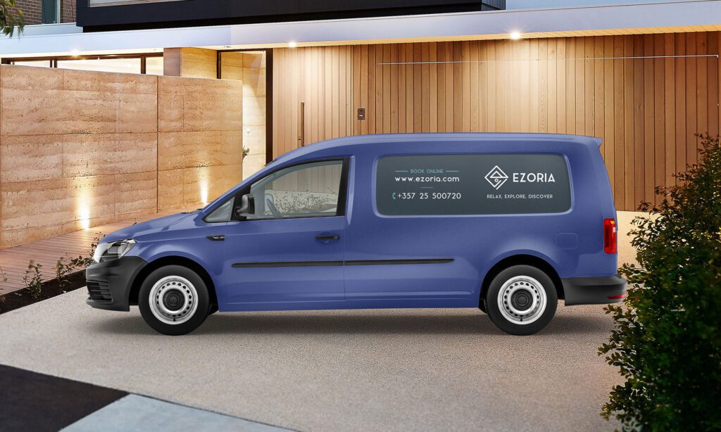
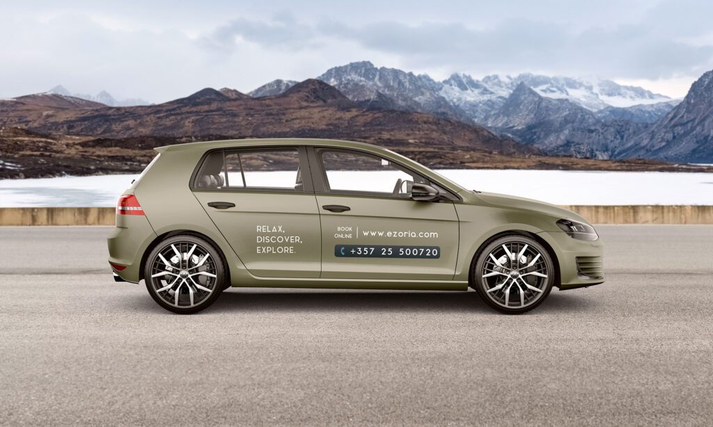
CAR & VANS DESIGN
