What Are Logo Variations?
In our current era, a brand/business is required to be functional across all platforms and media. Having a one-size-fits-all logo is not enough and it’s not functional. Your logo is not your brand, but your brand Identity consists of so much more than just one logo.
“LOGO VARIATIONS ARE ALTERED, REARRANGED, AND SIMPLIFIED VERSIONS OF YOUR PRIMARY LOGO DESIGN.”
Your logo and brand identity* is the visual presentation and expression of your brand. It should be meaningful and functional in the real world. Not just beautiful. Therefore, building a successful brand identity requires various visual adaptations of your logo.
In this blog post, I will be explaining the most common logo variations (with visual examples), why you need them, and how to use them in your business and elevate your brand’s visibility.
* The logo is a part of the brand identity.
Why brands need logo variations?
Your logo is the visual expression of your brand, it will be used both in print and in digital form. Therefore, it should be versatile. Having a one-size-fits-all logo whether this is a horizontal version or a vertical version will keep you limited. Your brand should have the flexibility and ability to be utilized in a variety of different applications, mediums, and platforms.
WITHOUT LOGO VARIATIONS YOU ARE LIMITED.
Example:
Horizontal logos being placed in a square or circular signage, in a small sticker or a profile photo on social media, causes the logo to appear small and not legible.
Vertical logos being placed as signage in huge empty spaces, or the header of a website also causes the logo to appear exceedingly small and not legible.
These mistakes are harming your brand’s visibility.
LOGO VARIATIONS
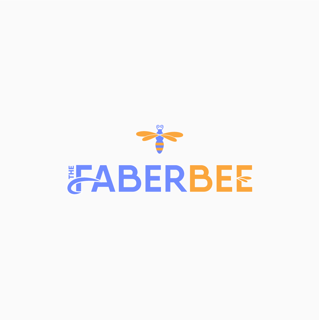
Primary Logo Design
The primary logo is the original version of a logo. The version that you will use often and the main identifier of your brand. All other brand logos will derive from this primary logo design.
Primary logos are typically horizontal and wide.
A primary logo consists of a symbol (brand icon), brand/business name (wordmark). It could also display a tagline, slogan, and year of establishment.
Placements: Website header, large print collateral, brand collateral (business cards, brochures, & leaflets.)
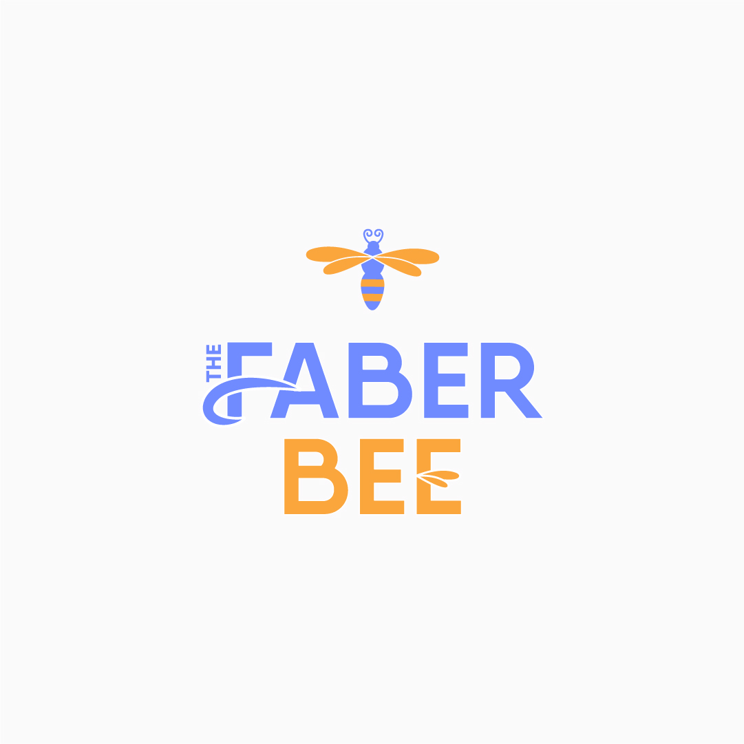
Secondary Logo
The secondary logo is a modified version (composition & orientation) of the primary logo.
Secondary logos are typically vertical and narrow.
It is used in areas that your primary logo (wider) normally wouldn’t fit or be readable.
A secondary logo consists of a symbol (brand icon), brand/business name (wordmark).
Placements: Social media, clothing tags, mobile website header, presentations, and printed material.
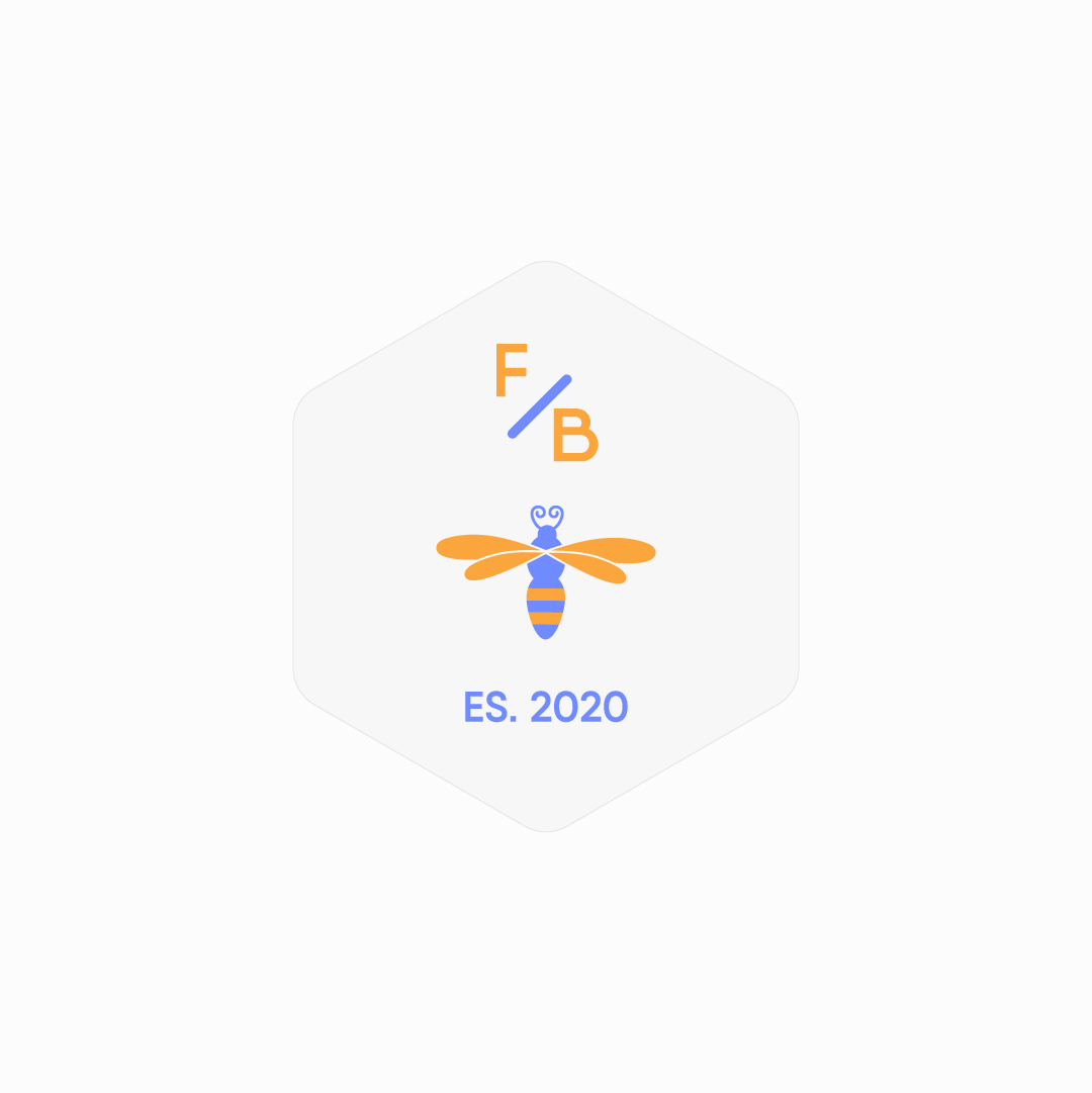
Submark
The submark is a simplified version of your primary logo. It is ideal for condensed spaces or the areas where a primary or secondary logo wouldn’t fit very well. Submark logos are typically circular, square, or a custom shape.
The submark logo consists of a symbol (brand icon), brand/business name initials (wordmark), and minor creative elements. It could also display a tagline, slogan, and year of establishment.
Placements: Social media profile images, website footer, small print pieces, social media graphics, stickers, presentation slides, stamps.
Favicon
The Favicon is a minimal version of your logo. It is usually overlooked because is a tiny element, but Favicon plays an important role as the other logo variations. Favicon is the final branded touch on your website.
Favicons are typically circular, square, transparent, or a custom shape.
The Favicon either includes the logo symbol if has a simple form or brand/business name initials.
Placements: Website browser tab
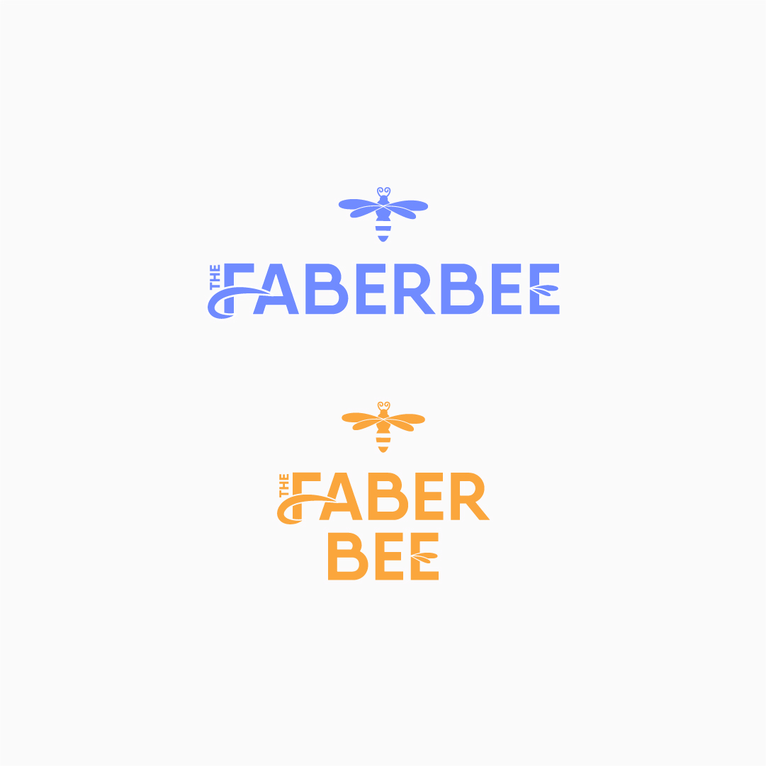
Monochrome
Monochrome variation consists of either the primary or the secondary color of your brand identity.
It is used as a cost-effective printing solution, to ensure the logo’s visibility when placed on image or pattern backgrounds, as a neutral option to be showcased online in website partner galleries.
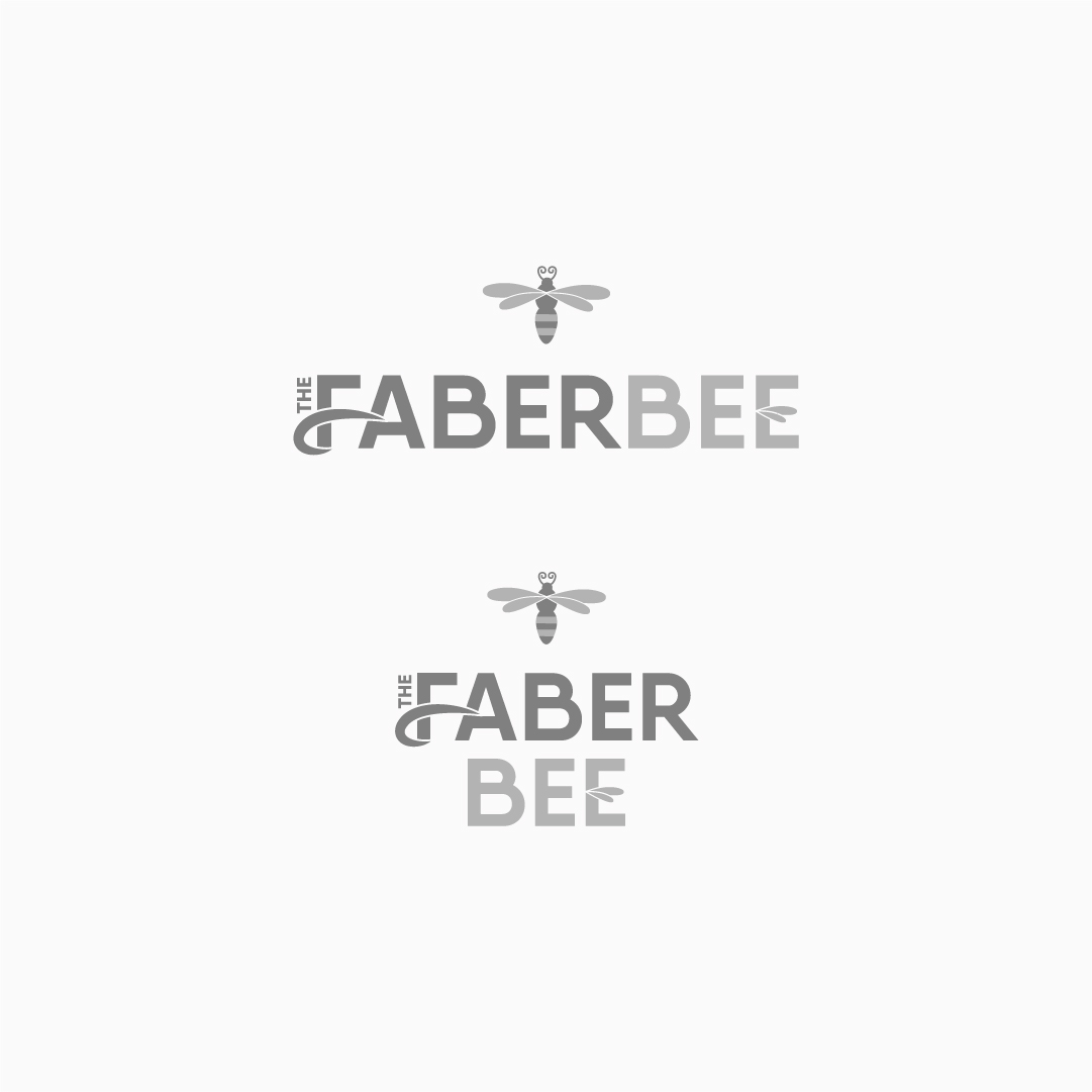
Greyscale
Greyscale variation consists of the entire scale of shades of grey. If your logo consists of more than one color or shade of color, a greyscale version is important, as the logo will appear visually accurate.
The grey shades will appear as strong or light as the original colors were. It is used as a cost-effective printing solution when printing in greyscale, as a neutral option to be showcased online in website partner galleries.
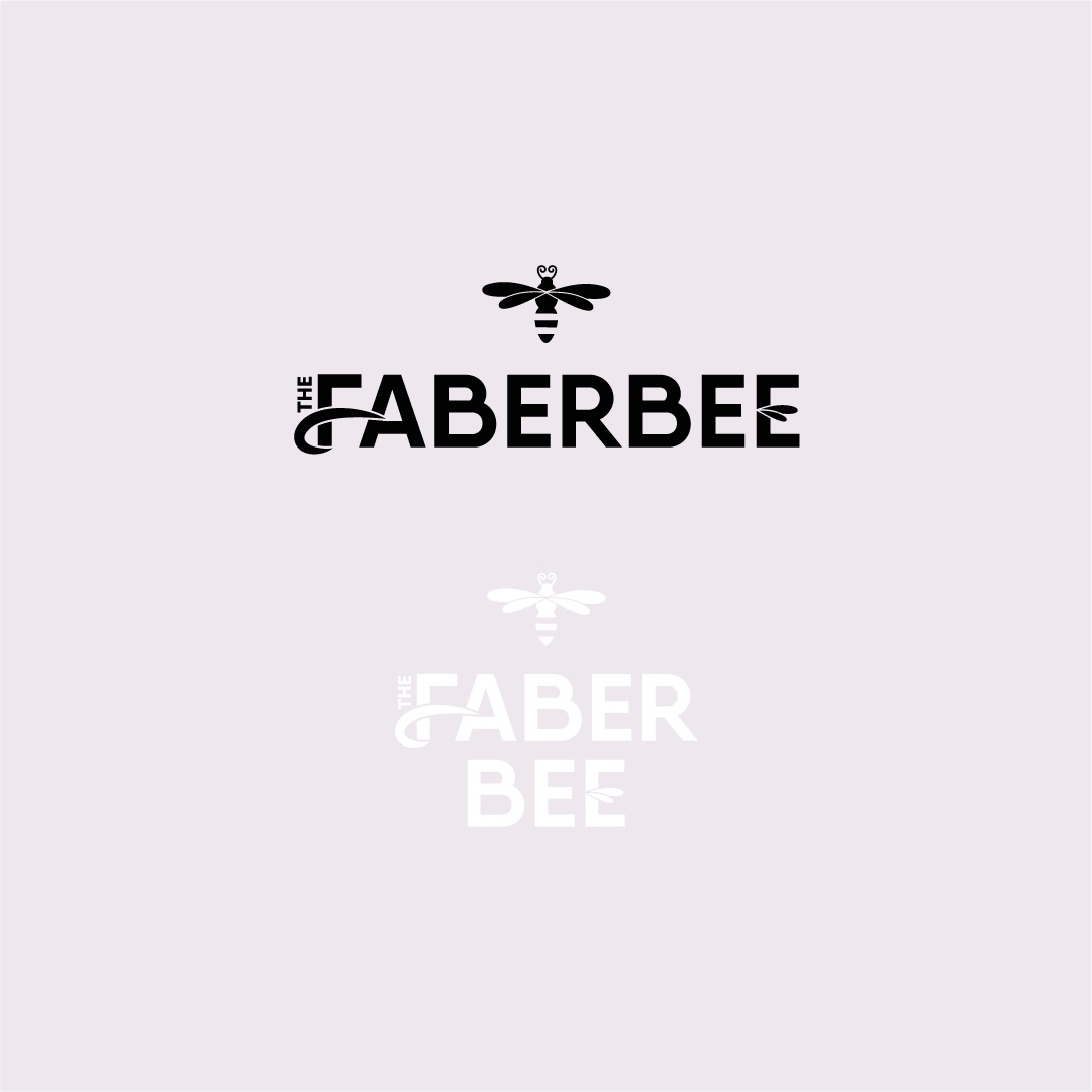
Black & White
Black & White variation consist of 2 solid colors, 100% black and 100% white. Both can be used to ensure the logo’s visibility when the brand identity colors are not visible enough or differentiate when placed on darker or lighter backgrounds.
It is used a cost-effective printing solution when printing in greyscale, as a neutral option to be showcased online in website partner galleries.
Greyscale / Black & white variations it is used in instruction manuals, newspapers
What types of logo variations should a brand have?
A brand in today’s world usually requires a physical presence as well as an online presence. For that reason, it is highly suggested that they should have at least a set of 4 core logo variations:
1. Primary logo
2. Secondary logo
3. Submark
4. Favicon
KEY POINTS:
• Successful brands are adaptable, functional, and versatile across all platforms and media.
• Logo variations will give your brand a consistent look
• 4 core logo variations (Primary logo, Secondary logo, Submark, Favicon)
• Favicon is as much important as the other logo variations
• Having a one-size-fits-all logo is not enough because is limiting your brand
PROS:
• Brand Adaptability
• Brand Functionality
• Brand Versatility
• Brand Consistency
CONS:
• Brand visual limitation
• Unprofessional
• Harming brand visibility
I hope this post helped you understand the importance of logo variations, why your brand needs to have them, and how to use them. Intrigued to learn more about the right process of building a brand?
Read my blog post about Logo file formats explained.

